Quick Look Plotting#
There is some basic plotting code built into otter.plotter library for quickly viewing the SED and lightcurves of individual transients.
Like always, we import what we need and then load in the otter dataset:
[1]:
%load_ext autoreload
%autoreload 2

import os
import otter
import numpy as np
import pandas as pd
import plotly
import matplotlib.pyplot as plt

db = otter.Otter()
Attempting to login to https://otter.idies.jhu.edu/api with the following credentials:
username: user-guest
password: test
Basic Plotting#
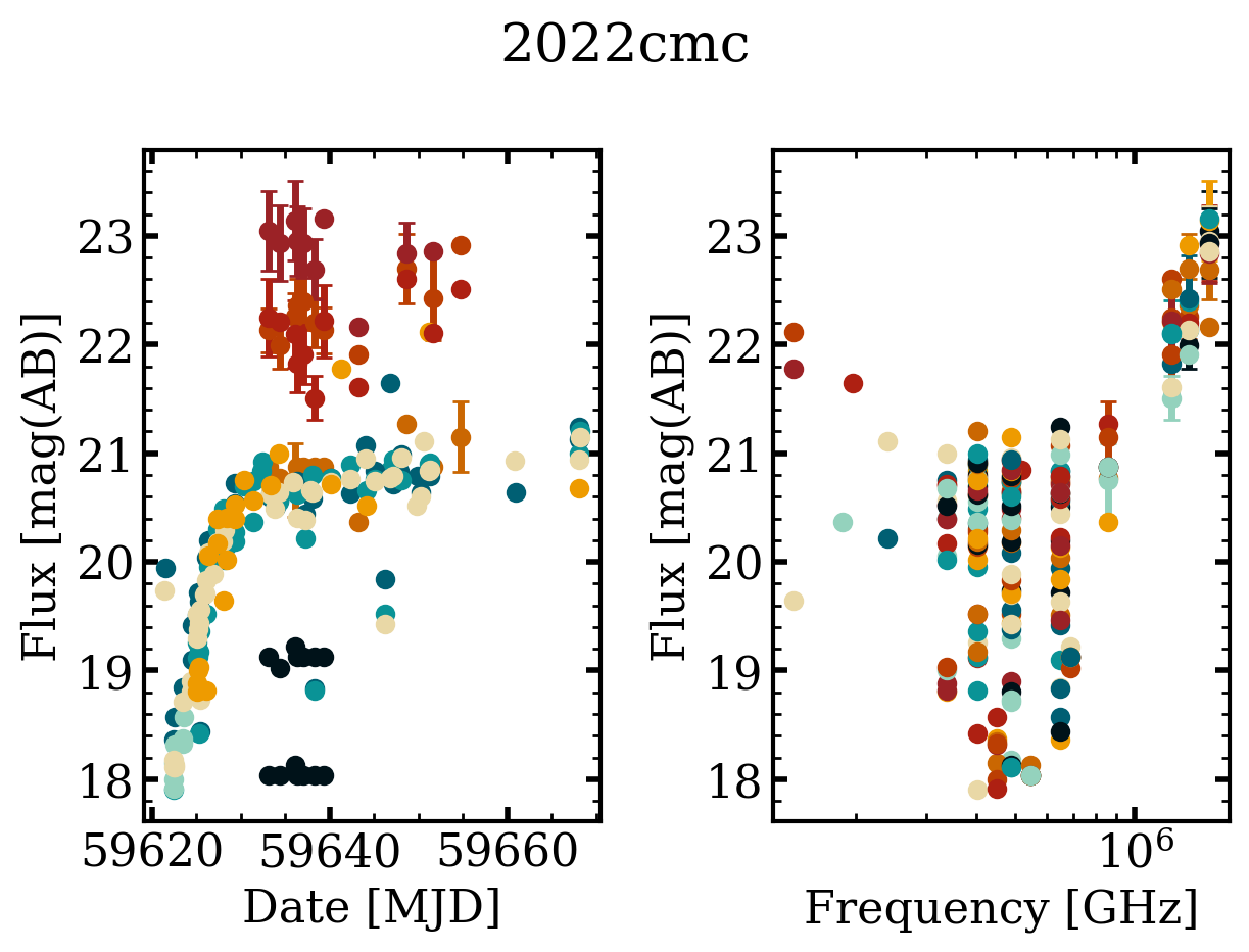
The easiest way to then plot the data is using the query_quick_view method which will query OTTER based on the typical keyword arguments you give it. For example, here we are querying for all transients with redshift greater than 1. As we saw in the basic_usage.ipynb tutorial, this should return three plots. But, there is no UV/Optical/IR data associated with two of them in OTTER so it only created one for AT2022cmc.
[3]:
figs = otter.query_quick_view(db, classification="TDE", minz=1, plotting_kwargs=dict(linestyle='none', marker='o'), phot_cleaning_kwargs=dict(obs_type='uvoir'))
Swift J2058.4+0516 has at least one photometry point where it is unclear if a host subtraction was performed. This can be especially detrimental for UV data. Please consider filtering out UV/Optical/IR or radio rows where the corr_host column is null/None/NaN.
2022cmc has at least one photometry point where it is unclear if a host subtraction was performed. This can be especially detrimental for UV data. Please consider filtering out UV/Optical/IR or radio rows where the corr_host column is null/None/NaN.

Instead of querying for objects, say we already have a Transient object that we want to look at the data for. For this we can instead use the quick_view method!
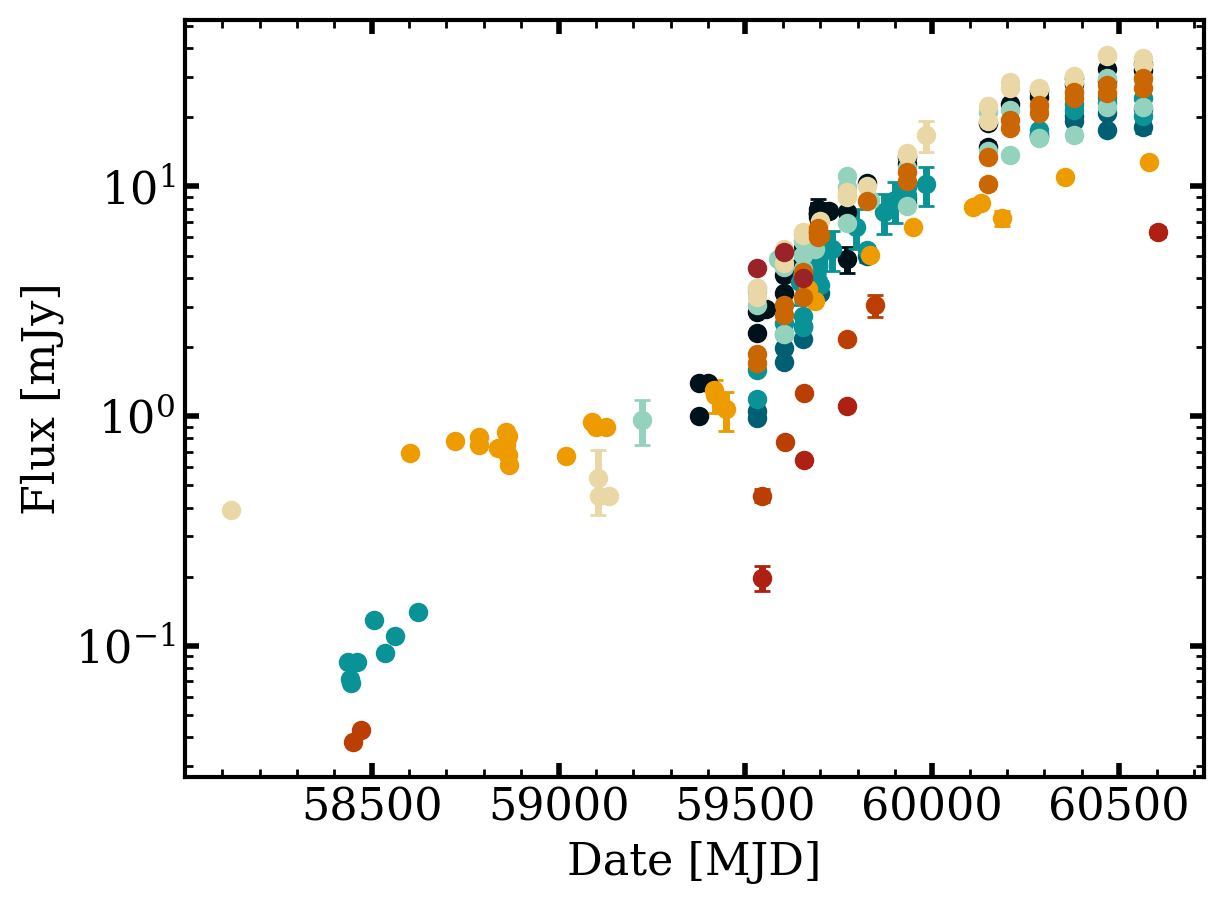
First, we plot the light curve:
[4]:
t = db.query(names='AT2018hyz')[0]
fig = otter.quick_view(t, ptype='lc', plotting_kwargs=dict(marker='o', linestyle='none'), flux_unit='mJy', obs_type='radio')
axs = fig.get_axes()
axs[0].set_yscale('log')
/home/nfranz/research/astro-otter/otter/src/otter/io/transient.py:1072: UserWarning: Boolean Series key will be reindexed to match DataFrame index.
  for val_av, grp in subset[outdata.corr_av == True].groupby("val_av"):
2018hyz has at least one photometry point where it is unclear if a host subtraction was performed. This can be especially detrimental for UV data. Please consider filtering out UV/Optical/IR or radio rows where the corr_host column is null/None/NaN.
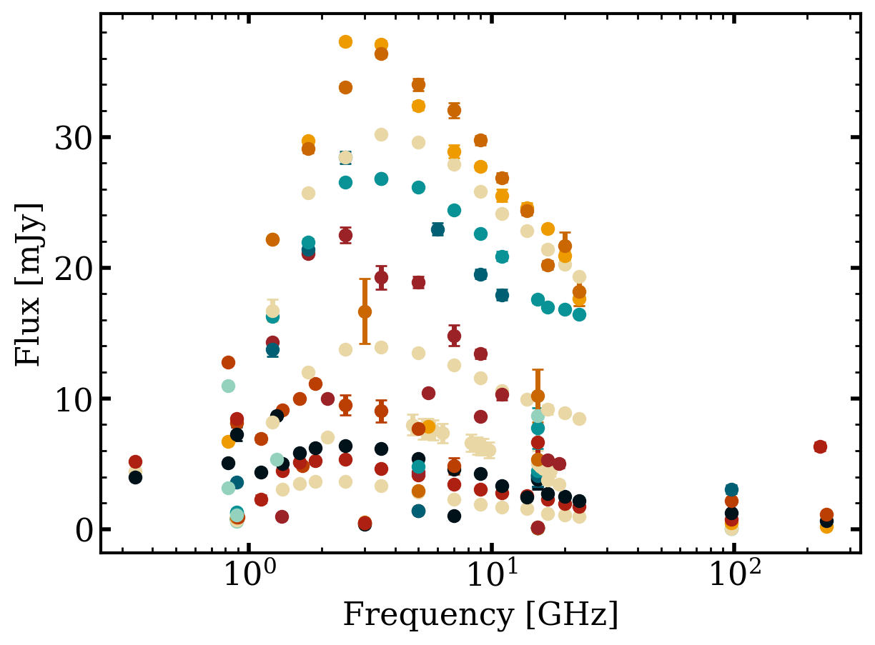
Then the spectral energy distribution:
[5]:
fig = otter.quick_view(t, ptype='sed', dt_over_t=0.0001, plotting_kwargs=dict(marker='o', linestyle='none'), flux_unit='mJy', obs_type='radio')
/home/nfranz/research/astro-otter/otter/src/otter/io/transient.py:1072: UserWarning: Boolean Series key will be reindexed to match DataFrame index.
  for val_av, grp in subset[outdata.corr_av == True].groupby("val_av"):
2018hyz has at least one photometry point where it is unclear if a host subtraction was performed. This can be especially detrimental for UV data. Please consider filtering out UV/Optical/IR or radio rows where the corr_host column is null/None/NaN.
Note that you can also put these on a subplot together with the keyword ptype='both'!
Slightly More Complex Plotting#
This next part becomes very useful if you want to generate interactive figures. To do this, we switch the plotting backend from matplotlib to plotly and use the plot_light_curve and plot_sed methods directly.
Let’s keep using the AT2018hyz dataset since it is pretty complete. First we need to get the photometry associated with this object:
[6]:
phot = db.get_phot(names="AT2018hyz", return_type='pandas', obs_type='radio', flux_unit='mJy')
phot
/home/nfranz/research/astro-otter/otter/src/otter/io/transient.py:1072: UserWarning: Boolean Series key will be reindexed to match DataFrame index.
  for val_av, grp in subset[outdata.corr_av == True].groupby("val_av"):
2018hyz has at least one photometry point where it is unclear if a host subtraction was performed. This can be especially detrimental for UV data. Please consider filtering out UV/Optical/IR or radio rows where the corr_host column is null/None/NaN.
[6]:
| name | converted_flux | converted_flux_err | converted_date | converted_wave | converted_freq | converted_flux_unit | converted_date_unit | converted_wave_unit | converted_freq_unit | filter_name | obs_type | upperlimit | reference | human_readable_refs | telescope | |
|---|---|---|---|---|---|---|---|---|---|---|---|---|---|---|---|---|
| 0 | 2018hyz | 2.172 | 0.061 | 59772.0 | 3.074794e+06 | 97.5 | mJy | MJD | nm | GHz | alma.3 | radio | False | 2026ApJ...998..111C | Cendes, Yvette et al. (2026) | ALMA |
| 1 | 2018hyz | 1.110 | 0.040 | 59772.0 | 1.249135e+06 | 240.0 | mJy | MJD | nm | GHz | alma.6 | radio | False | 2026ApJ...998..111C | Cendes, Yvette et al. (2026) | ALMA |
| 2 | 2018hyz | 3.035 | 0.330 | 59846.0 | 3.074794e+06 | 97.5 | mJy | MJD | nm | GHz | alma.3 | radio | False | 2026ApJ...998..111C | Cendes, Yvette et al. (2026) | ALMA |
| 3 | 2018hyz | 0.038 | 0.000 | 58450.0 | 3.074794e+06 | 97.5 | mJy | MJD | nm | GHz | alma.3 | radio | True | 2020MNRAS.497.1925G | Gomez et al. (2020) | ALMA |
| 4 | 2018hyz | 0.043 | 0.000 | 58471.0 | 3.074794e+06 | 97.5 | mJy | MJD | nm | GHz | alma.3 | radio | True | 2020MNRAS.497.1925G | Gomez et al. (2020) | ALMA |
| ... | ... | ... | ... | ... | ... | ... | ... | ... | ... | ... | ... | ... | ... | ... | ... | ... |
| 220 | 2018hyz | 3.449 | 0.041 | 59603.0 | 4.282749e+07 | 7.0 | mJy | MJD | nm | GHz | C | radio | False | 2026ApJ...998..111C | Cendes, Yvette et al. (2026) | VLA |
| 221 | 2018hyz | 4.553 | 0.140 | 59655.0 | 4.282749e+07 | 7.0 | mJy | MJD | nm | GHz | C | radio | False | 2026ApJ...998..111C | Cendes, Yvette et al. (2026) | VLA |
| 222 | 2018hyz | 1.870 | 0.032 | 59530.0 | 3.331027e+07 | 9.0 | mJy | MJD | nm | GHz | X | radio | False | 2026ApJ...998..111C | Cendes, Yvette et al. (2026) | VLA |
| 223 | 2018hyz | 3.056 | 0.054 | 59603.0 | 3.331027e+07 | 9.0 | mJy | MJD | nm | GHz | X | radio | False | 2026ApJ...998..111C | Cendes, Yvette et al. (2026) | VLA |
| 224 | 2018hyz | 4.249 | 0.124 | 59655.0 | 3.331027e+07 | 9.0 | mJy | MJD | nm | GHz | X | radio | False | 2026ApJ...998..111C | Cendes, Yvette et al. (2026) | VLA |
225 rows × 16 columns
We can then generate a light curve using the plotly backend. For more details on the optional kwargs I pass in see https://plotly.com/python-api-reference/generated/plotly.graph_objects.Figure.html#plotly.graph_objects.Figure.add_scatter
[7]:
discovery_date = db.get_meta(names='AT2018hyz')[0].get_discovery_date().mjd

# split up the dataset by the filter name and then plot each independently
graph_object = plotly.graph_objects.Figure()
for filter_name, df in phot.groupby('filter_name'):

    fig = otter.plot_light_curve(
        date = df.converted_date - discovery_date,
        flux = df.converted_flux,
        flux_err = df.converted_flux_err,
        backend = 'plotly',
        ylabel = 'Flux [mJy]',
        xlabel = 'MJD',
        ax = graph_object, # pass in a graph object to the ax keyword
        name = filter_name,
        mode='markers'
    )

fig.update_xaxes(type='log')
And we can do the same with SEDs
[8]:
# split up the dataset by the filter name and then plot each independently
graph_object = plotly.graph_objects.Figure()
for filter_name, df in phot.groupby('converted_date'):

    fig = otter.plot_sed(
        wave_or_freq = df.converted_freq,
        flux = df.converted_flux,
        flux_err = df.converted_flux_err,
        backend = 'plotly',
        ylabel = 'Flux [mJy]',
        xlabel = 'Frequency [GHz]',
        ax = graph_object, # pass in a graph object to the ax keyword
        name = filter_name,
        mode='markers'
    )

fig.update_xaxes(type='log')
More Complex Plotting: Asymmetric Errorbars#
Because of the nature of the otter data storage, we store only one error for each flux value. However, this can be limiting when the raw data really has Asymmetric Errorbars. This section will walk through getting and plotting the data with these assymetric_errorbars.
We will use x-ray observations of the IR selected TDE WTP15acbgpn.
[9]:
t2 = db.query(names='WTP15acbgpn')[0]
phot = t2.clean_photometry(obs_type='xray', flux_unit='Jy')
phot.raw_err_detail
WTP15acbgpn has at least one photometry point where it is unclear if a host subtraction was performed. This can be especially detrimental for UV data. Please consider filtering out UV/Optical/IR or radio rows where the corr_host column is null/None/NaN.
[9]:
0    {'upper': [9.999999999999999e-14, 5.6000000000...
1    {'upper': [9.999999999999999e-14, 5.6000000000...
2    {'upper': [2.41769675e-13], 'lower': [2.020235...
Name: raw_err_detail, dtype: object
As you can see, the raw_err_detail column holds dictionaries with the corresponding upper and lower values on the asymmetric errorbars. NOTE: These values will never be converted so we have to do that by hand!
To add them to the dataframe in a better format we can use some pandas groupby magic:
[10]:
cleaned_phot = []

# first, create a column of the dictionaries as a string
# this is necessary because python dictionaries are not hashable
phot['raw_err_detail_str'] = phot.raw_err_detail.astype(str)

# then we can groupby the string version of the dictionaries
for _, p in phot.groupby('raw_err_detail_str'):
    err_detail_df = pd.DataFrame(p.raw_err_detail.iloc[0]) # convert the dict in the first row to a dataframe
    err_detail_df = err_detail_df.set_index(p.index) # align the indices
    df = pd.concat([p, err_detail_df], axis=1) # horizontally merge these dataframes
    cleaned_phot.append(df)

# then combine all the data!
cleaned_phot = pd.concat(cleaned_phot)
cleaned_phot
[10]:
| converted_flux | converted_flux_err | converted_date | converted_wave | converted_freq | converted_flux_unit | converted_date_unit | converted_wave_unit | converted_freq_unit | reference | ... | wave_max | val_host | _flux | filter_key | date_format | date | raw_err_detail | raw_err_detail_str | upper | lower | |
|---|---|---|---|---|---|---|---|---|---|---|---|---|---|---|---|---|---|---|---|---|---|
| 2 | 5.606876e-07 | 1.575369e-07 | 58078.083919 | 0.127819 | 2.345450e+09 | Jy | MJD | nm | GHz | 2024ApJ...961..211M | ... | 4.132807 | NaN | 7.897495e-13 | 0.3-10 | mjd | 58078.083919 | {'upper': [2.41769675e-13], 'lower': [2.020235... | {'upper': [2.41769675e-13], 'lower': [2.020235... | 2.417697e-13 | 2.020235e-13 |
| 0 | 3.465099e-07 | 4.408917e-08 | 55424.364387 | 0.190745 | 1.571693e+09 | Jy | MJD | nm | GHz | [2024ApJ...961..211M] | ... | 2.479684 | NaN | 7.820000e-13 | 0.5-7 | mjd | 55424.364387 | {'upper': [9.999999999999999e-14, 5.6000000000... | {'upper': [9.999999999999999e-14, 5.6000000000... | 1.000000e-13 | 9.900000e-14 |
| 1 | 3.292287e-07 | 2.459245e-08 | 55374.843319 | 0.190745 | 1.571693e+09 | Jy | MJD | nm | GHz | [2024ApJ...961..211M] | ... | 2.479684 | NaN | 7.430000e-13 | 0.5-7 | mjd | 55374.843319 | {'upper': [9.999999999999999e-14, 5.6000000000... | {'upper': [9.999999999999999e-14, 5.6000000000... | 5.600000e-14 | 5.500000e-14 |
3 rows × 46 columns
So now we have upper and lower columns that describe the asymmetric errorbars for each flux value! Next, we need to convert these.
Since we have the raw values and converted flux values, this is pretty straight forward! Just using proportionalities we can use the following approximations to find the converted uncertainties.
[11]:
cleaned_phot['converted_upper'] = cleaned_phot.converted_flux * (cleaned_phot.upper / cleaned_phot.raw)
cleaned_phot['converted_lower'] = cleaned_phot.converted_flux * (cleaned_phot.lower / cleaned_phot.raw)

cleaned_phot
[11]:
| converted_flux | converted_flux_err | converted_date | converted_wave | converted_freq | converted_flux_unit | converted_date_unit | converted_wave_unit | converted_freq_unit | reference | ... | _flux | filter_key | date_format | date | raw_err_detail | raw_err_detail_str | upper | lower | converted_upper | converted_lower | |
|---|---|---|---|---|---|---|---|---|---|---|---|---|---|---|---|---|---|---|---|---|---|
| 2 | 5.606876e-07 | 1.575369e-07 | 58078.083919 | 0.127819 | 2.345450e+09 | Jy | MJD | nm | GHz | 2024ApJ...961..211M | ... | 7.897495e-13 | 0.3-10 | mjd | 58078.083919 | {'upper': [2.41769675e-13], 'lower': [2.020235... | {'upper': [2.41769675e-13], 'lower': [2.020235... | 2.417697e-13 | 2.020235e-13 | 1.716459e-07 | 1.434279e-07 |
| 0 | 3.465099e-07 | 4.408917e-08 | 55424.364387 | 0.190745 | 1.571693e+09 | Jy | MJD | nm | GHz | [2024ApJ...961..211M] | ... | 7.820000e-13 | 0.5-7 | mjd | 55424.364387 | {'upper': [9.999999999999999e-14, 5.6000000000... | {'upper': [9.999999999999999e-14, 5.6000000000... | 1.000000e-13 | 9.900000e-14 | 4.431073e-08 | 4.386762e-08 |
| 1 | 3.292287e-07 | 2.459245e-08 | 55374.843319 | 0.190745 | 1.571693e+09 | Jy | MJD | nm | GHz | [2024ApJ...961..211M] | ... | 7.430000e-13 | 0.5-7 | mjd | 55374.843319 | {'upper': [9.999999999999999e-14, 5.6000000000... | {'upper': [9.999999999999999e-14, 5.6000000000... | 5.600000e-14 | 5.500000e-14 | 2.481401e-08 | 2.437090e-08 |
3 rows × 48 columns
Finally, we can plot this data similarly to above! The only difference is that we will use the matplotlib backend and pass in a list of tuples for the flux_err keyword.
[12]:
fig, ax = plt.subplots()
for filter_name, df in cleaned_phot.groupby('filter_name'):
    otter.plot_light_curve(
        date = df.converted_date,
        flux = df.converted_flux,
        flux_err = df[['converted_upper', 'converted_lower']].values.T,
        fig=fig,
        ax=ax,
        linestyle='none',
        marker='o',
        label=f'{filter_name}keV'
    )

ax.set_yscale('log')
ax.legend()
[12]:
<matplotlib.legend.Legend at 0x70ede4172360>
[ ]: